Logo Don'ts
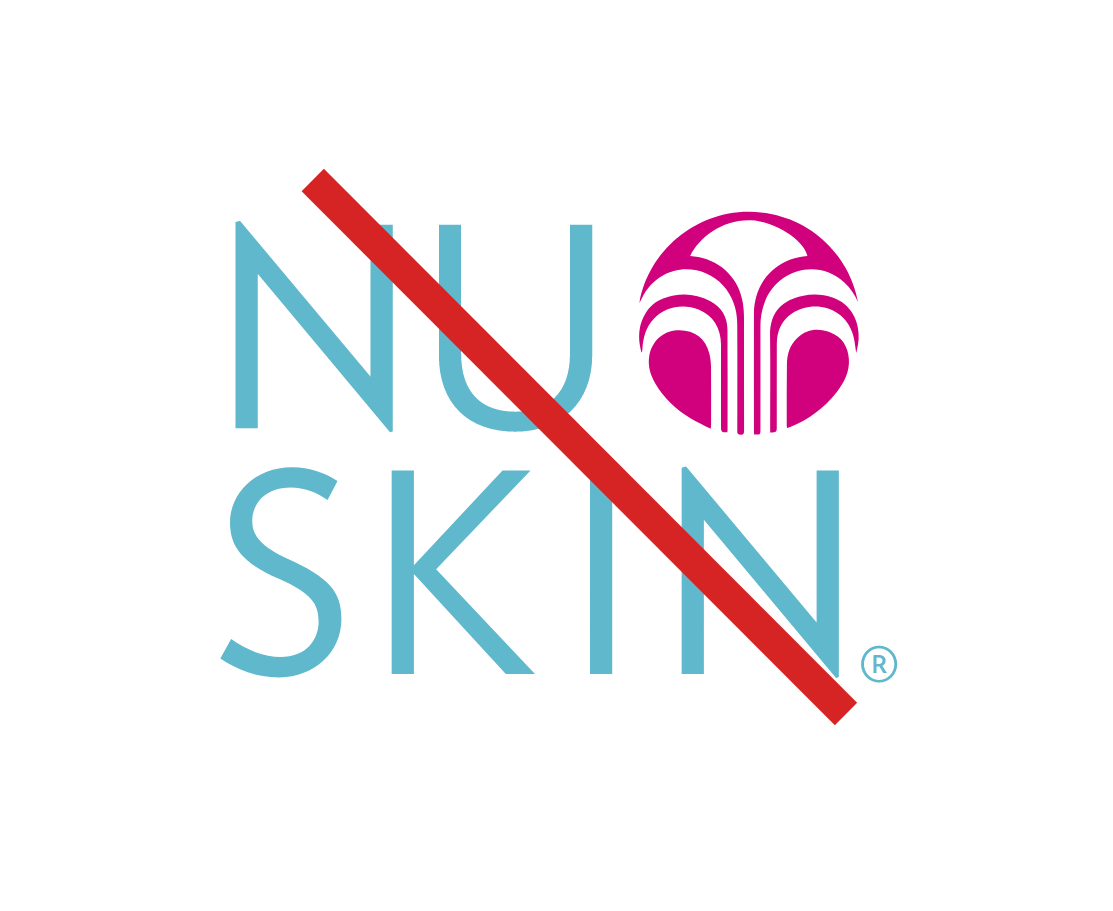
We no longer use the stacked logo. It can be misread by people unfamiliar with the Nu Skin brand. If you need a logo in a square area, consider using the fountain icon.
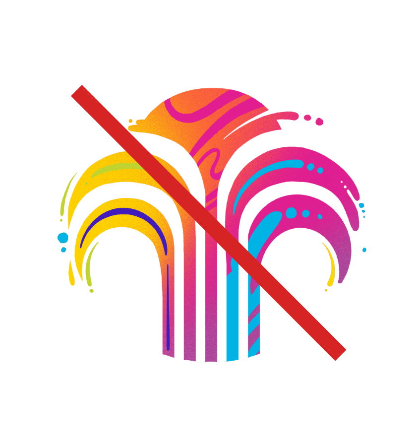
Don't use the graffiti fountain icons. We're retiring all graffiti elements.

Don't break the logo design. Don't combine the logo into a graphic design.

Don't use the logo or elements over distracting images. Don't cover important details in an image with the logo.
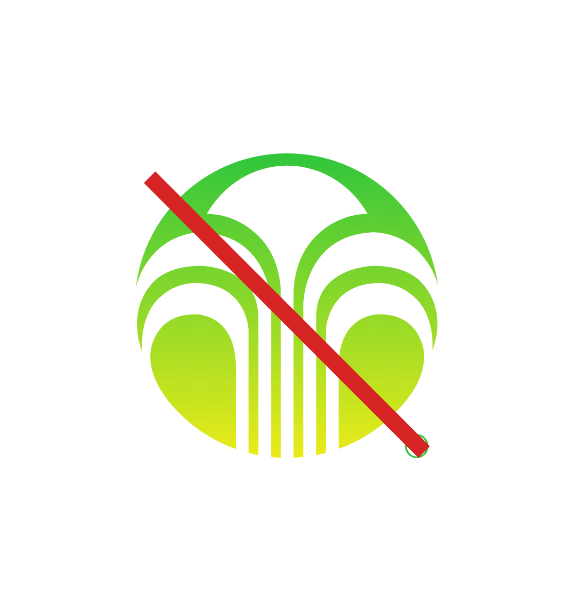
Don't apply gradients to the logo or logo elements.
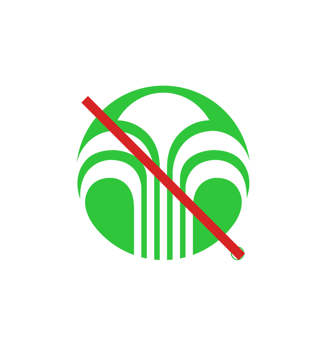
Do not use old branding colors or colors that are not approved brand colors.
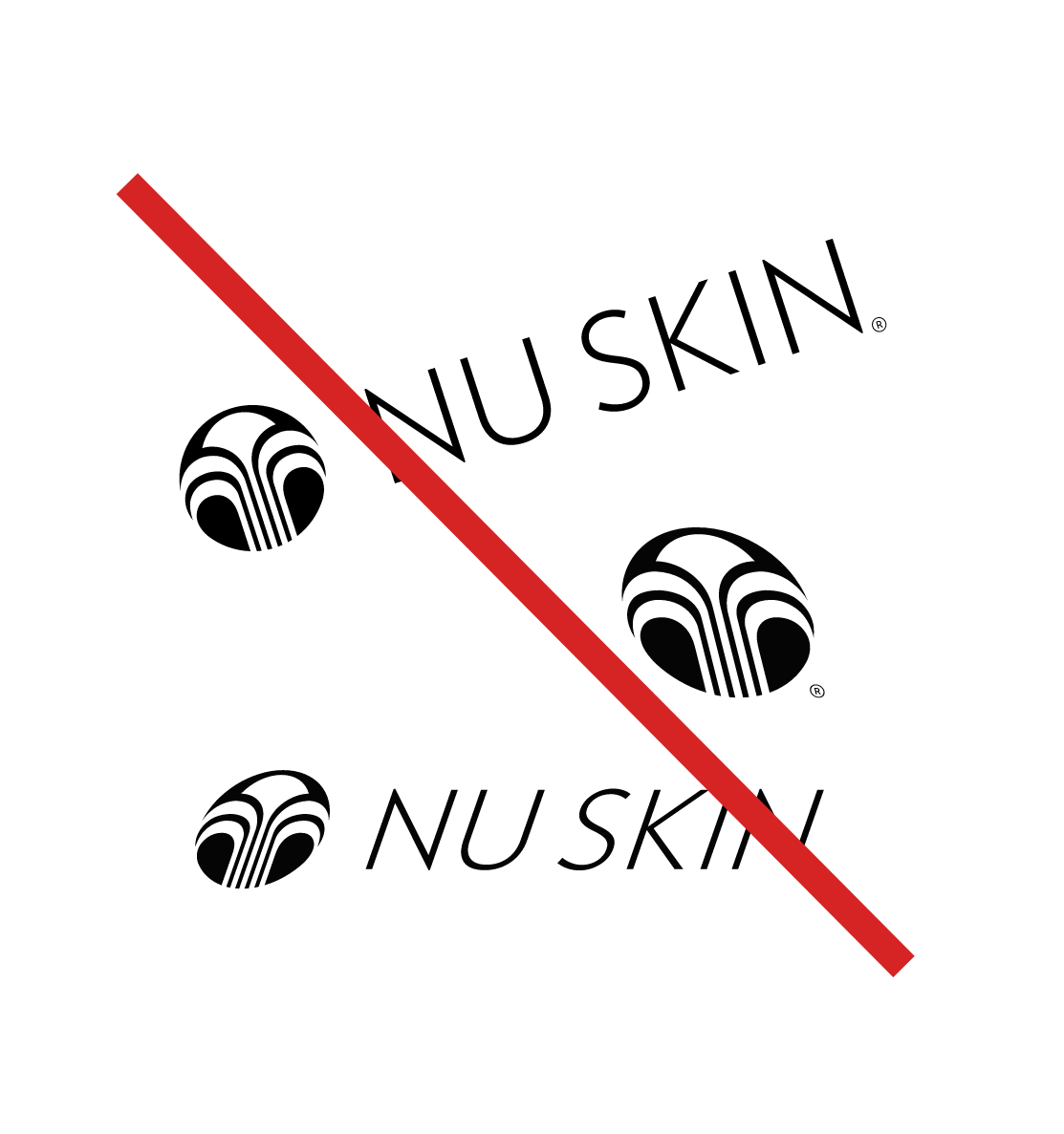
Do not distort the logo, elements, or wordmarks. Don't rotate, shear, or stretch the logo.
We do not use old fountain icons.
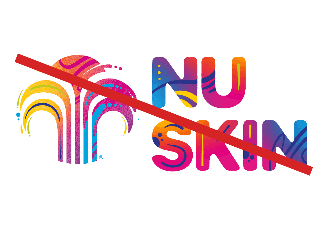
We no longer use graffiti in our designs or in the logo.
