Logo in Action
Here are a few examples that show how you can display our logo as you create a variety of materials.
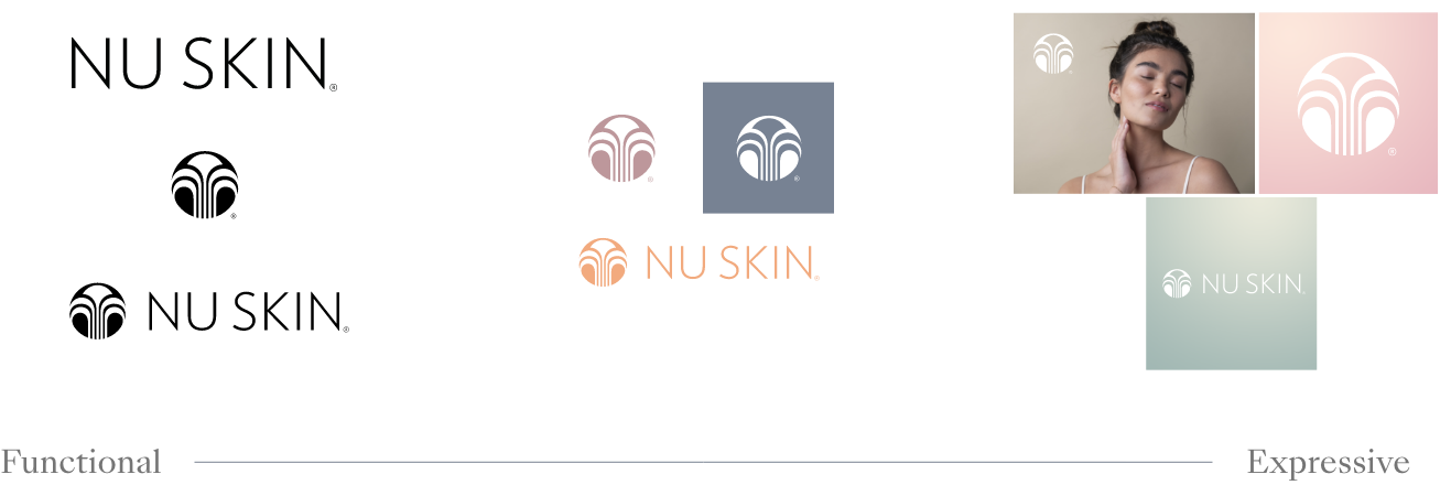
Use the Functional logo when appropriate (for instance, in a press release), and feel free to use Flexible elements to customize the logo to your needs for materials like social posts and ads.
The wordmark is the preferred logo. Black is the preferred color. You can place it over our various brand colors.

When you use the logo in a design, you need to give the logo enough space. Use the letter N as your measurement guide.
You can use the logo with any of our brand colors including black, grey, and white.

We have introduced several gradient designs with our new brand colors. You can use the logo over the gradients.
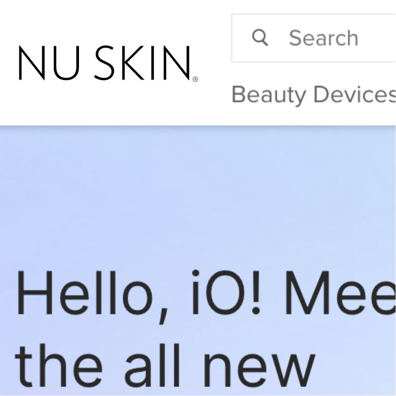
This is an example of the Nu Skin® wordmark used on a website.

You can feature the fountain logo over textures, but make sure it doesn’t distract from the image.
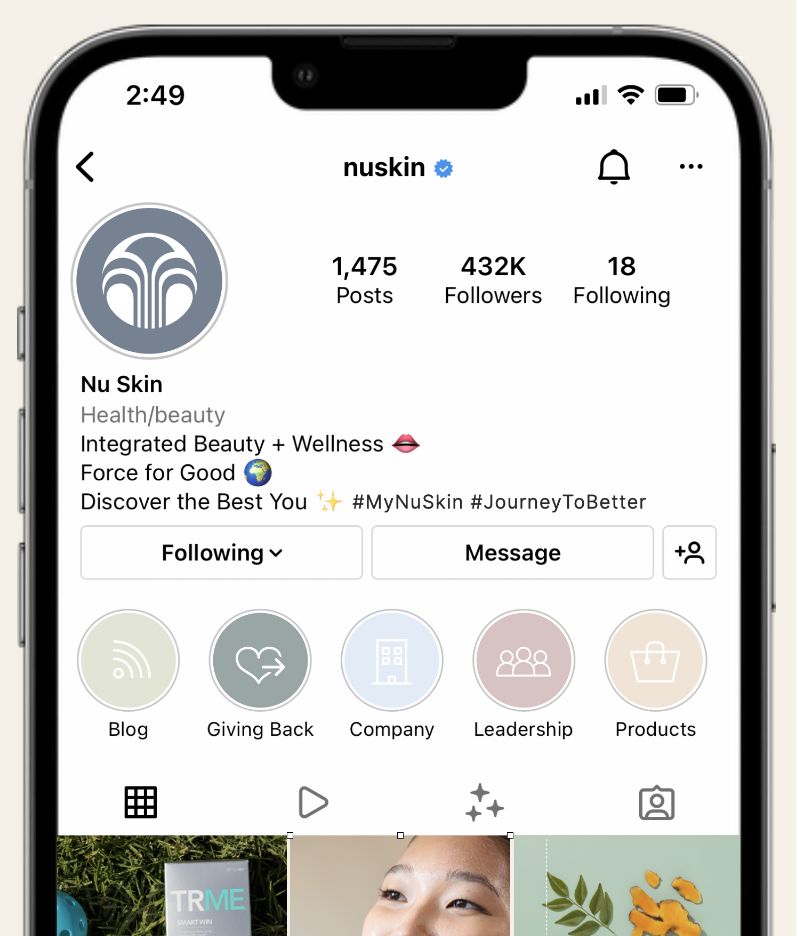
The fountain icon works well in circular or square areas, such as social media avatars or profile photos.

The wordmark is preferred, however, using the wordmark and fountain together is a welcome alternative.

You can place the logo over photos. Just be mindful of how and where you place it and ensure it’s not obscured by distracting elements.
